Meetings: A Love and Hate Affair [Meeting Infographic]
The folks at Lane End Conferences recently put together an infographic about meetings that they’ve asked us to share (see the full picture below). We were intrigued because, unlike most infographics on the topic, this one acknowledges just a bit of love (a wee teensy bit, but still) for the much maligned meeting.
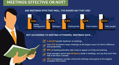
When you see an article about work meetings on a popular blog or social media, you’ll usually see some statistics meant to show how much time these meetings waste. Most readers expect an article that talks about a fix for bad meetings to include one of these ugly stats. It makes sense; using data to reinforce a point is a basic tactic used by authors to increase the perception that they know their stuff. I do it, they do it, it’s the way blogging gets done.
When it comes to meetings, though, it’s tricky to conduct well-grounded research on whether any given meeting was a good use of time. Good for whom? What does effective mean, anyway? Do you measure effectiveness by the quality of the result (also subjective!) or by how the participants say the meeting made them feel? Then, we extend this tricky research to make statements that cover all meetings in general, which gets even stranger.
The Lane End crew acknowledges that, when it comes to meetings, what we know is messy. Love, hate? Some of both, all in the same day. Check it out.
Quick Tip: Don’t use the British Pound? You can use a Google shortcut to get a currency conversion. For example, if you want to know what £341.29 is in US Dollars, you would enter 341.29 british pounds in us dollars.
Today’s answer: $520.61. That’s a spendy meeting!

https://www.lane-end-conferences.co.uk/Meetings_A_Love_and_Hate_Affair_Infographic.html
Looking for more of the big picture?
Check out some of the other posters and infographics we’ve posted here.